Advertising is just a game of tug of war. There are advertisers who put in so much work and effort yet still struggle to get their message across, and there are consumers who ignore all the efforts of advertisers. Signage can be the one thing that breaks the tug of war.
Why do signs work so well?
A good sign conveys a lot of information; they attract attention and effectively communicate a message. A good sign is compatible with its surroundings and can even reach drivers going at high speeds. Communities and businesses alike are working hard to grab the attention of tourists and shoppers. But a great looking sign isn’t all that’s needed to get a community’s or business’s message across. A good sign uses both strong design and graphics with readability and safety for the viewers.
Business owners use signs to ensure that their customers are able to
locate them. People use signs to find the services they require, i.e.
churches, hospitals, government buildings, and schools. Signage is an
important factor for branding, information, navigation, and inspiration.
So, what makes a sign good?
Continue reading below for some simple rules that will help your signage work effectively:
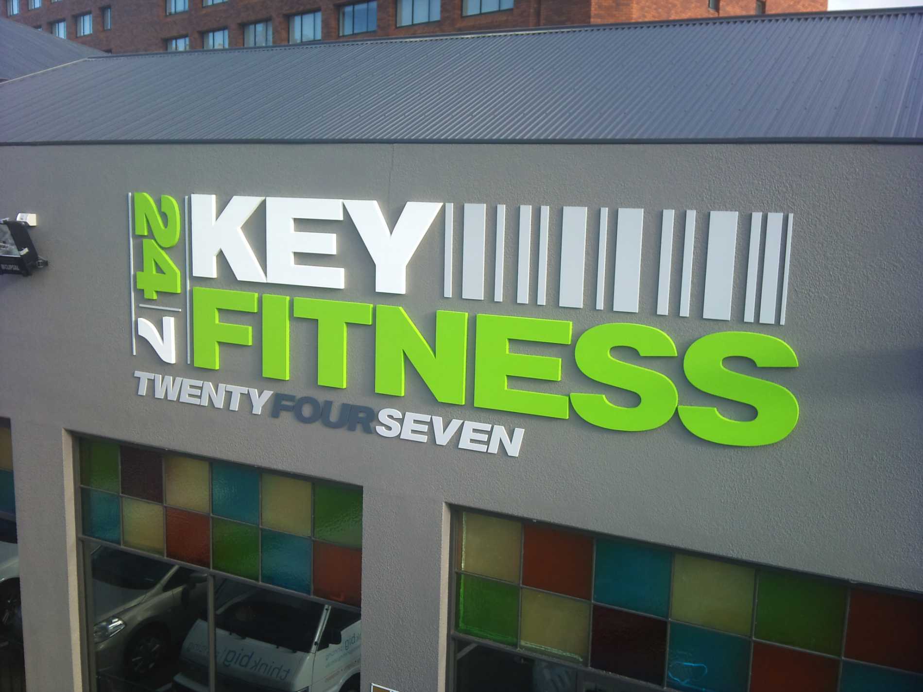

Keep it Simple
A simple design with impactful imagery drives engagement. Get your message across by concisely stating it in a few words for your target audience. Too many words crowd your sign and make it hard for anyone to understand.
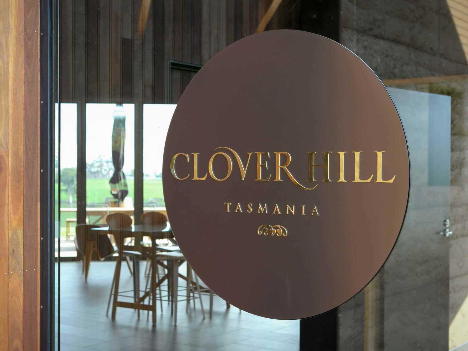
Use Colours to leave an Impression
A good sign needs to have colours that contrast with the environment. As a business owner or retailer, using a single colour scheme creates visual clout. Using the same aesthetics increases the likelihood of a breakthrough to your customers.
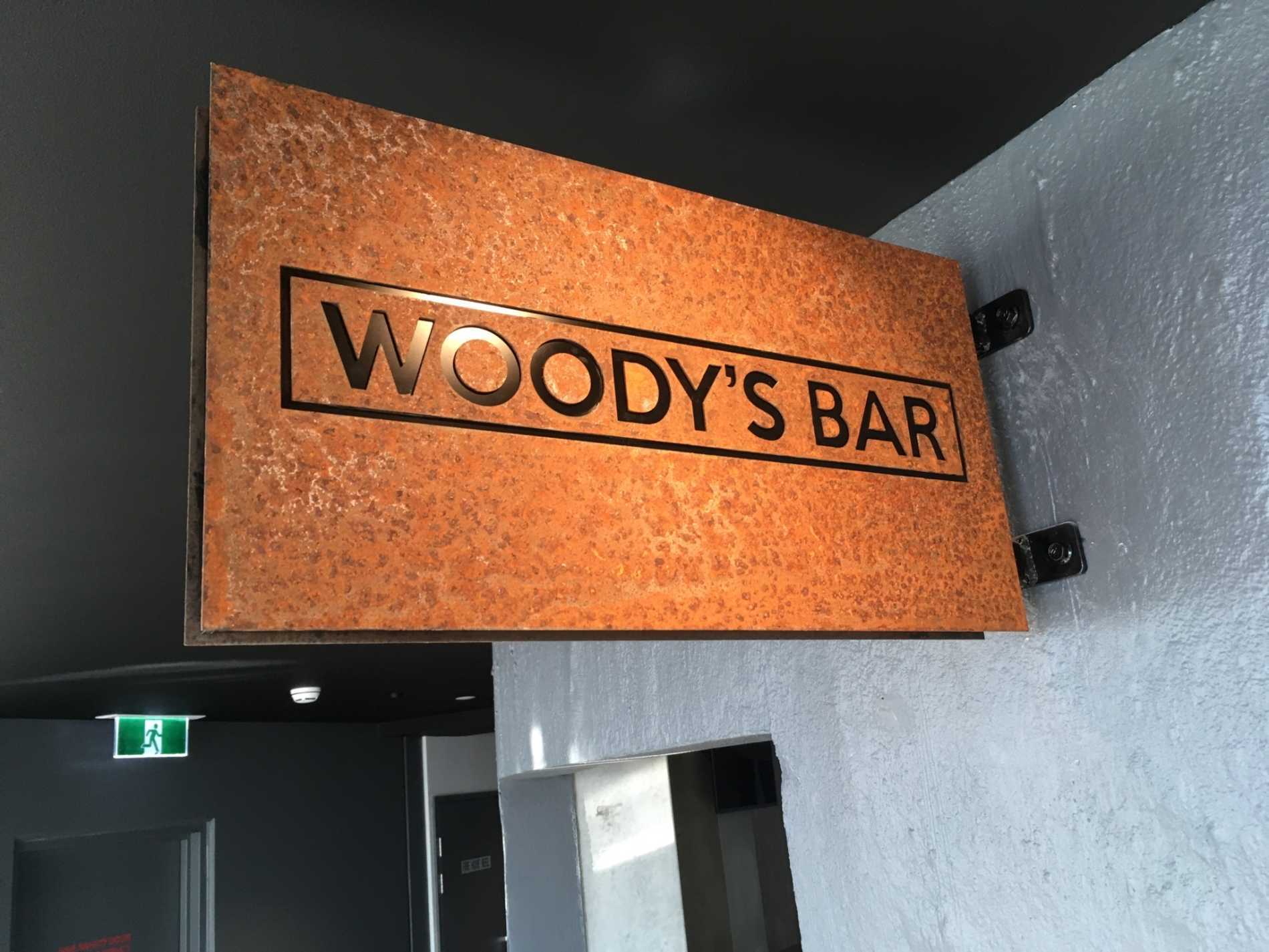
Textures Take it to Another Level
Colour is critical but have you thought of how textures and materials can set a tone and create a mood. Think of different materials that you can use to enhance your look. Steel can create a strong, industrial look, timber gives and softer natural feel and acrylic can present minimalist sleek finish.
Unique Shapes
Naturally, our eyes look immediately towards anything with a unique shape. Using unique shapes while developing a good sign in contrast with the environment improves the likelihood of it being viewed by passers-by.
Keep Headlines Short
Ideally, a good sign will have a headline of 3 to 5 words. Always use clean, crisp, and easy-to-read styles to get the maximum legibility. Keep in mind that using too many capital letters may cause the sign to lose its legibility. Using both upper and lower case letters will be more legible even from a far distance. Lastly, no more than two different fonts should be used in a single sign. The general rule of thumb is to leave 30 to 40 percent of the sign’s area as white space for optimal readability.
Use Engaging Visuals
In any good sign, visuals have to be the dominating element. These visuals easily appeal to the subconscious of a reader. Suggestive images are much more powerful than the functional images. Like, use an image that will bring strong feelings or images to the mind of a viewer rather than some static, day-to-day images without much thought behind them.
So, if you’re looking make your signage a powerful marketing tool, then try incorporating these tips to your signage design. Your sign will ultimately become more compelling and result in increased sales.
If you're not sure which way to turn when updating your signage, give us a call and we will you give a 30 minute obligation free consultation to help you understand any problems with your existing signage and how to overcome them.
Think Big have signage consultants available in Hobart and Launceston so call us on 1300 069 873 to make an appointment for your free consultation today.