It’s safe to assume everyone enjoys a café, and Launceston has no shortage of wonderful options. With local stores spread across the city, it’s hard to decide where to go. Think Big has a recommendation we believe is totally worth a visit.
We had the pleasure of supplying the lovely owners at Florence with both graphic design services and signage products during their recent rebranding.
- Client: Florence Café
- Date: 2022
Moving up from below City Park to Brisbane St, 320g Gourmet requested new branding and logo designs, the Café now named after the owners Grandmother, matches its deliciously fabulous, traditional European roots.
Our brief was to:
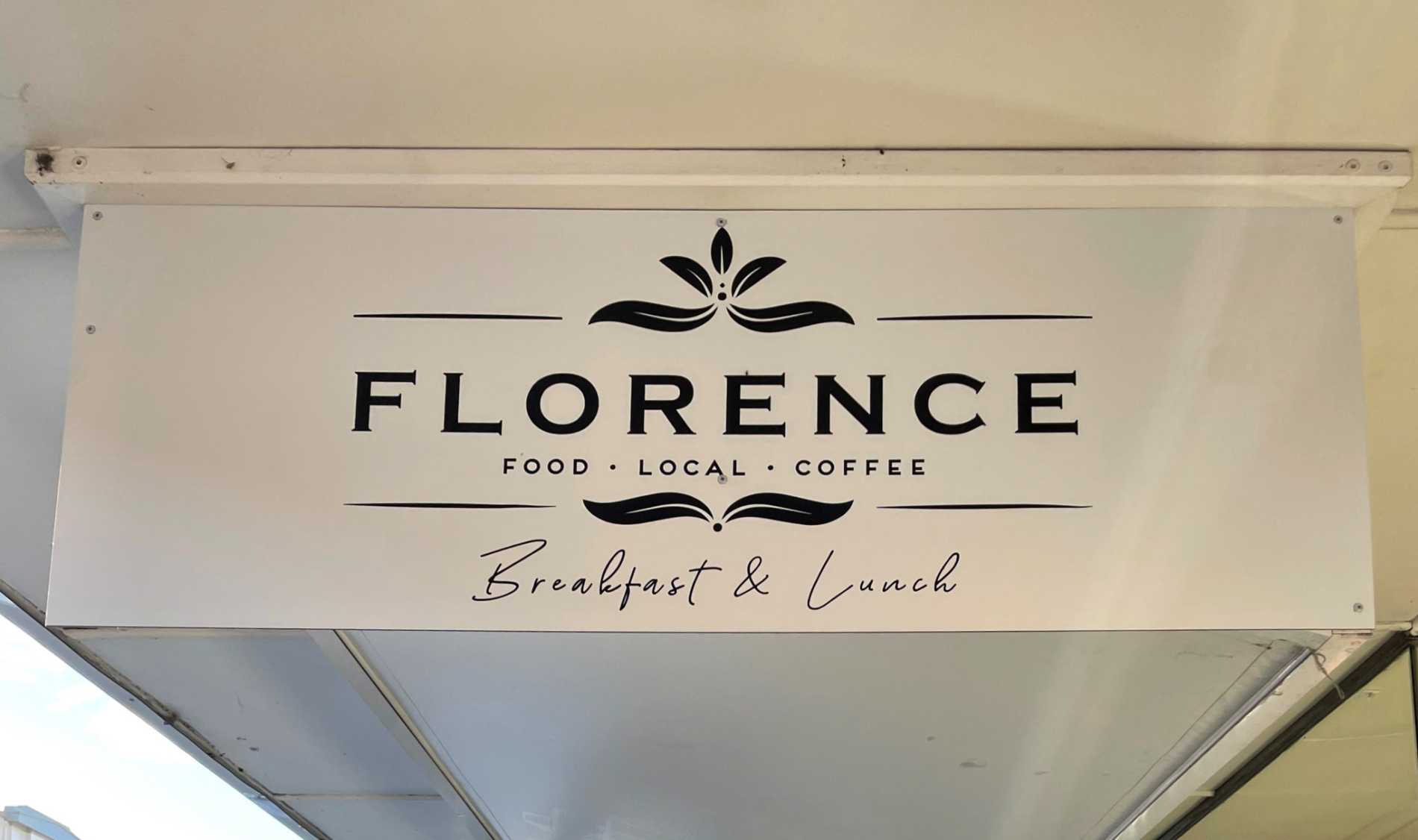
* Create new logo and branding to complement their traditional European heritage.
* The logo should be simple, elegant and with a classical influence.
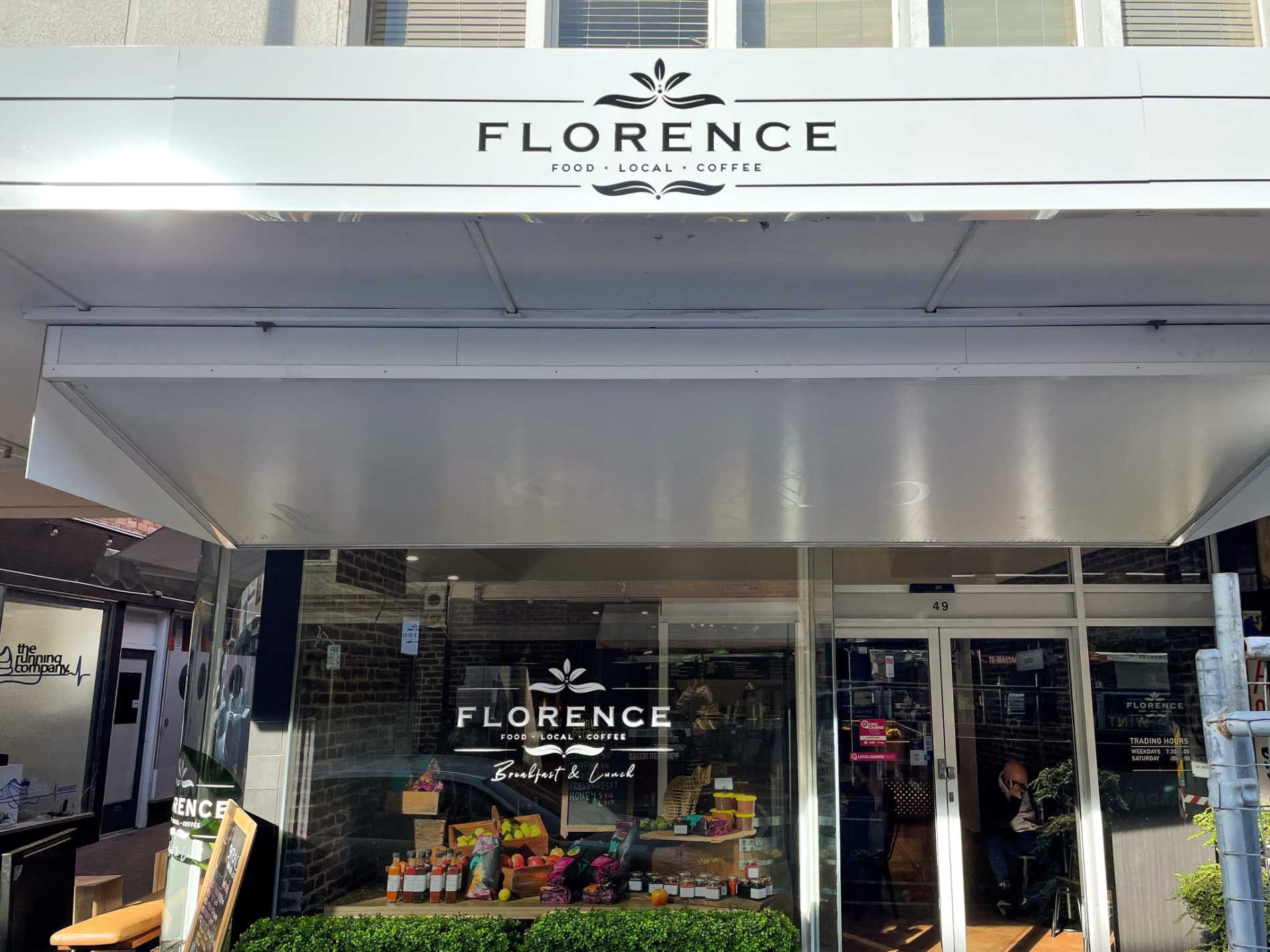
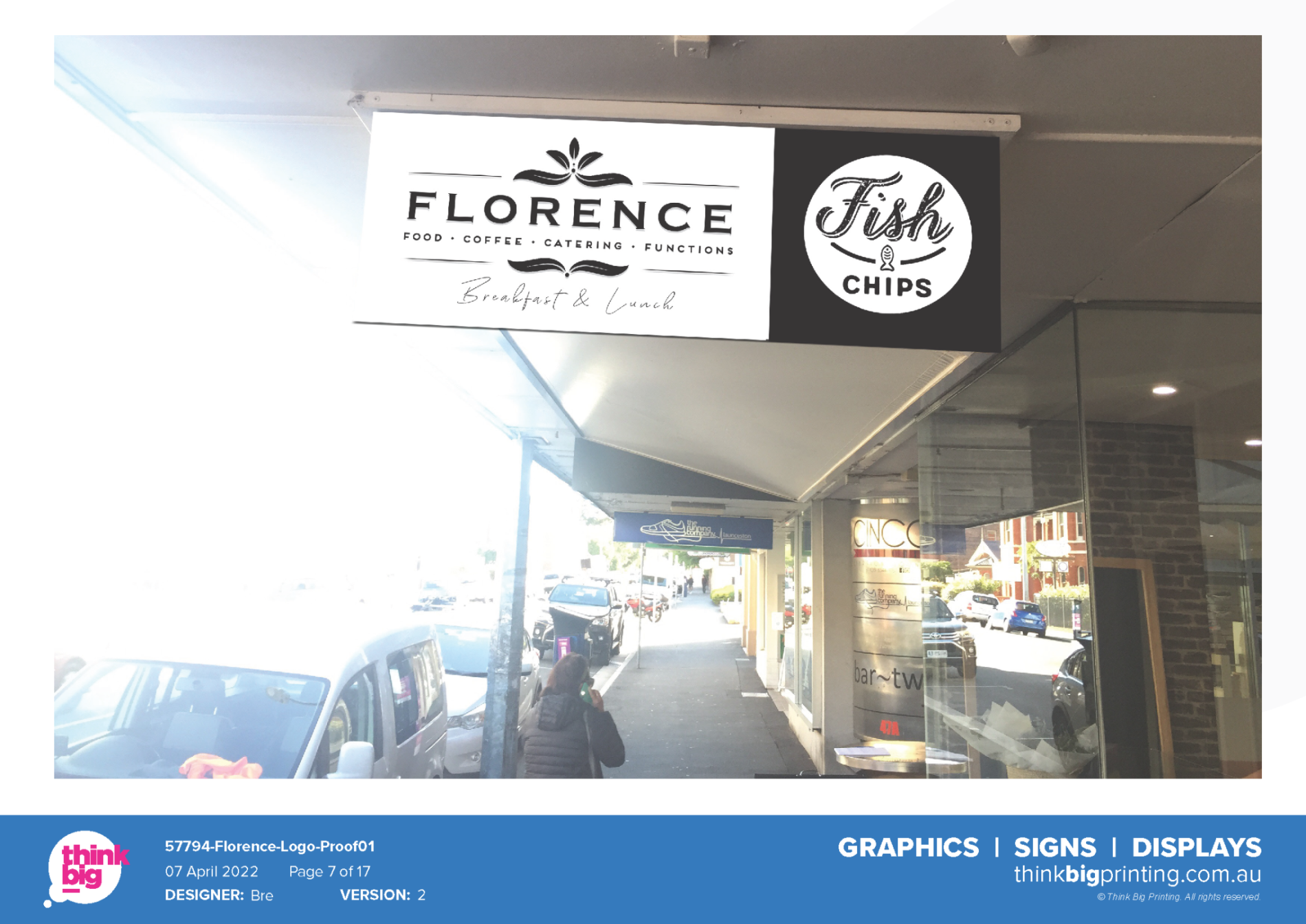
* Update exterior signage including awning and under awning signs.
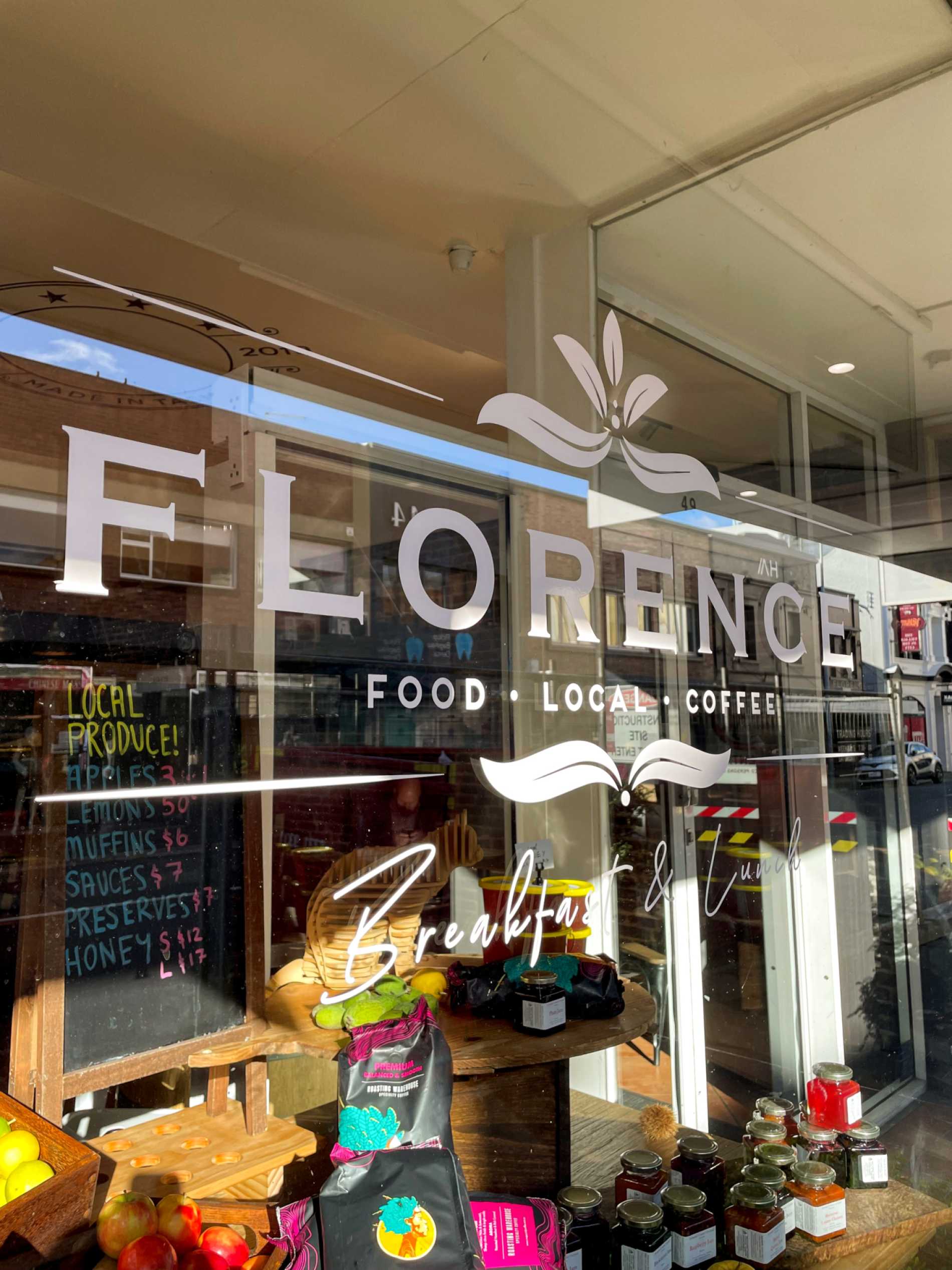
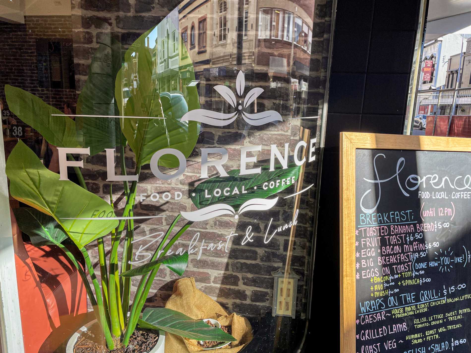
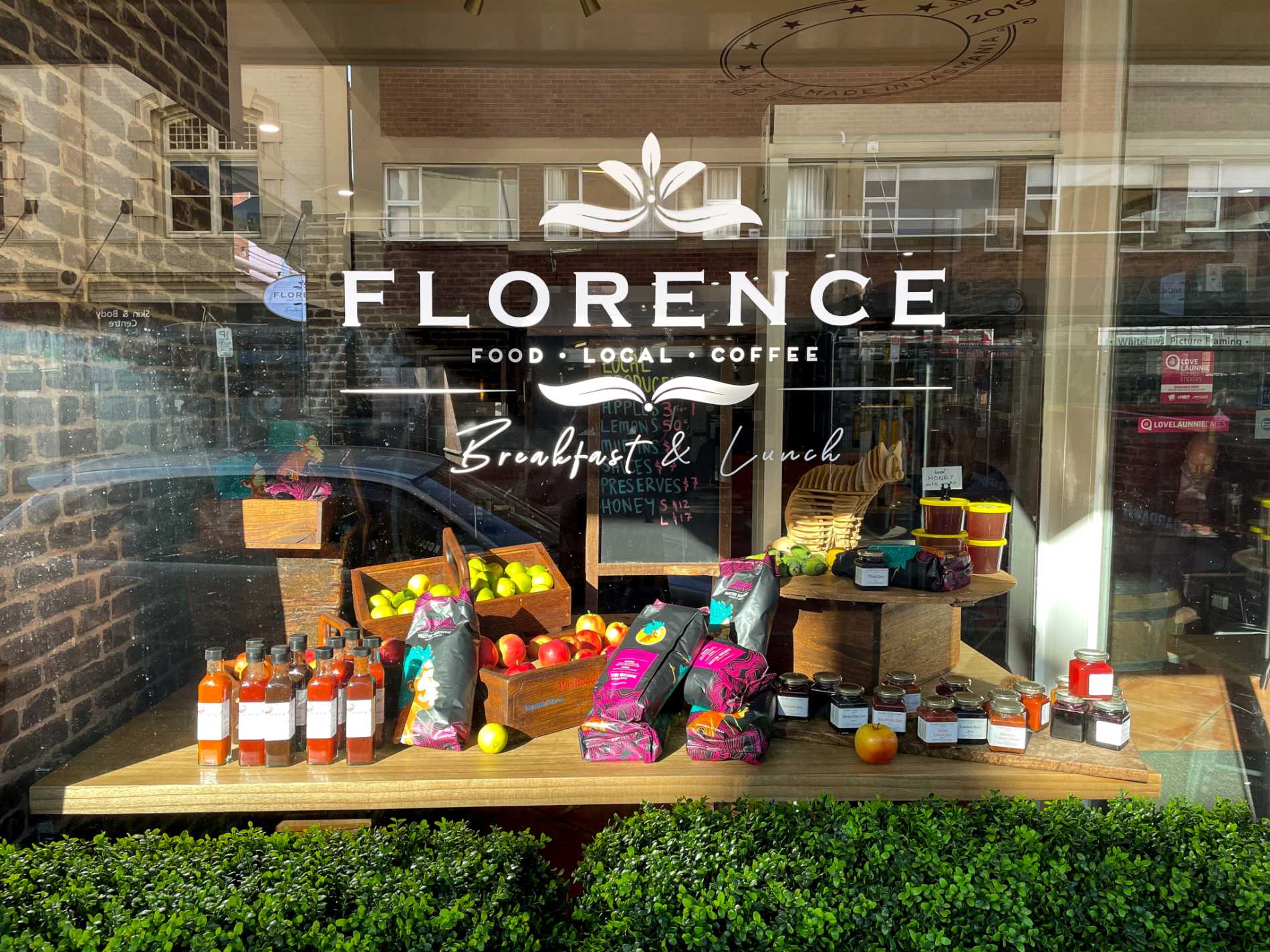
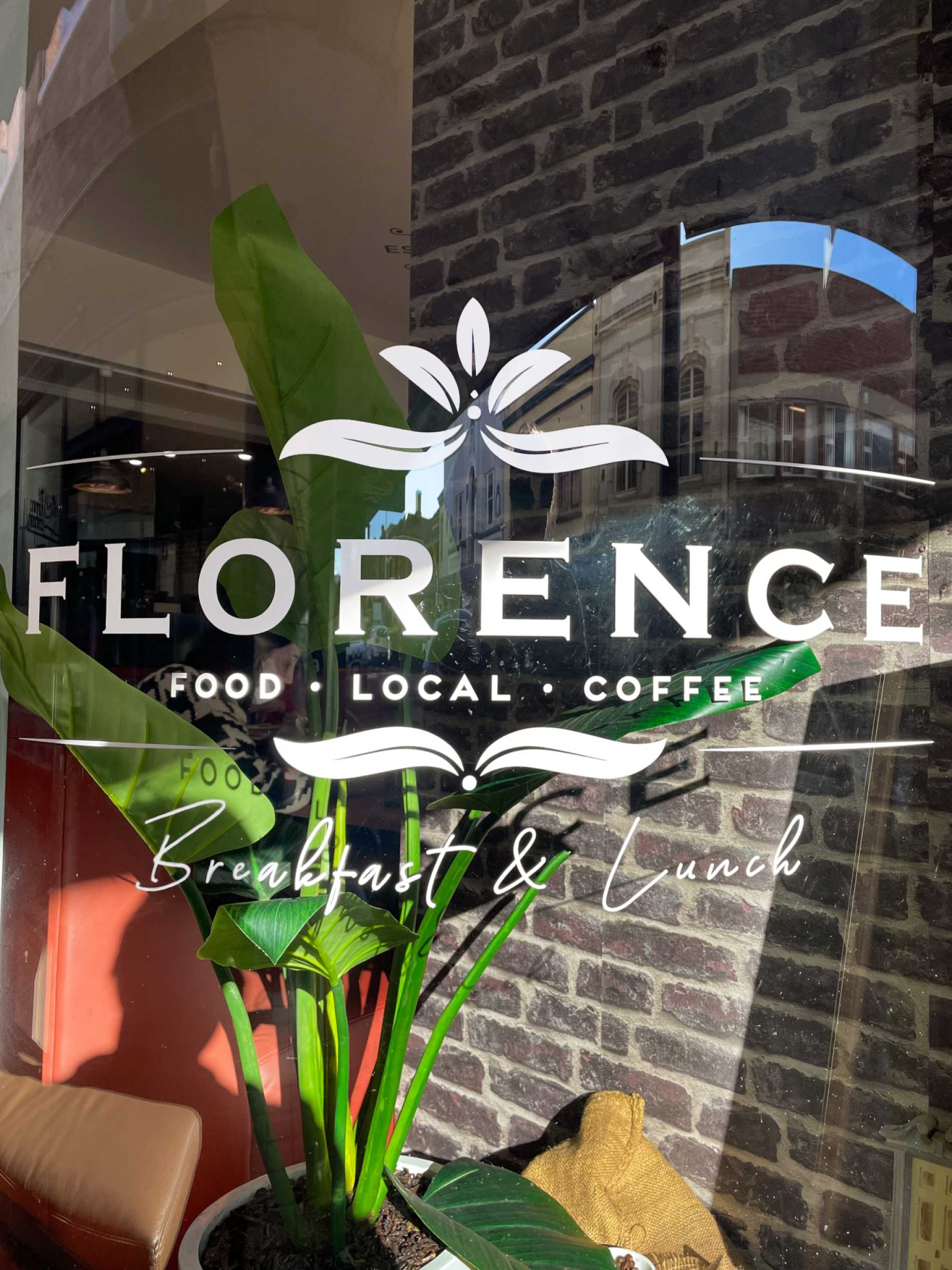
* Replace all window signage with the new logo.
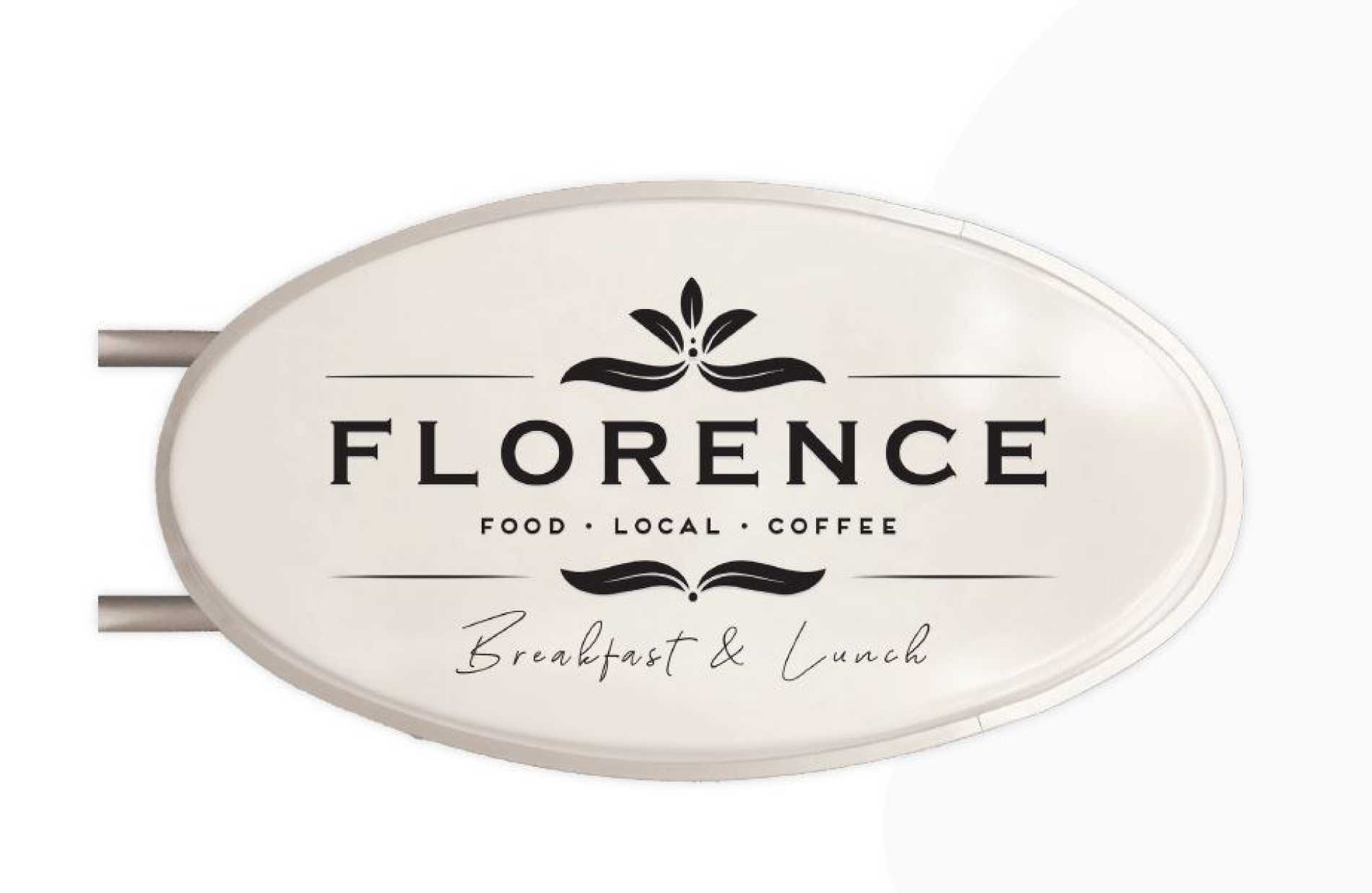
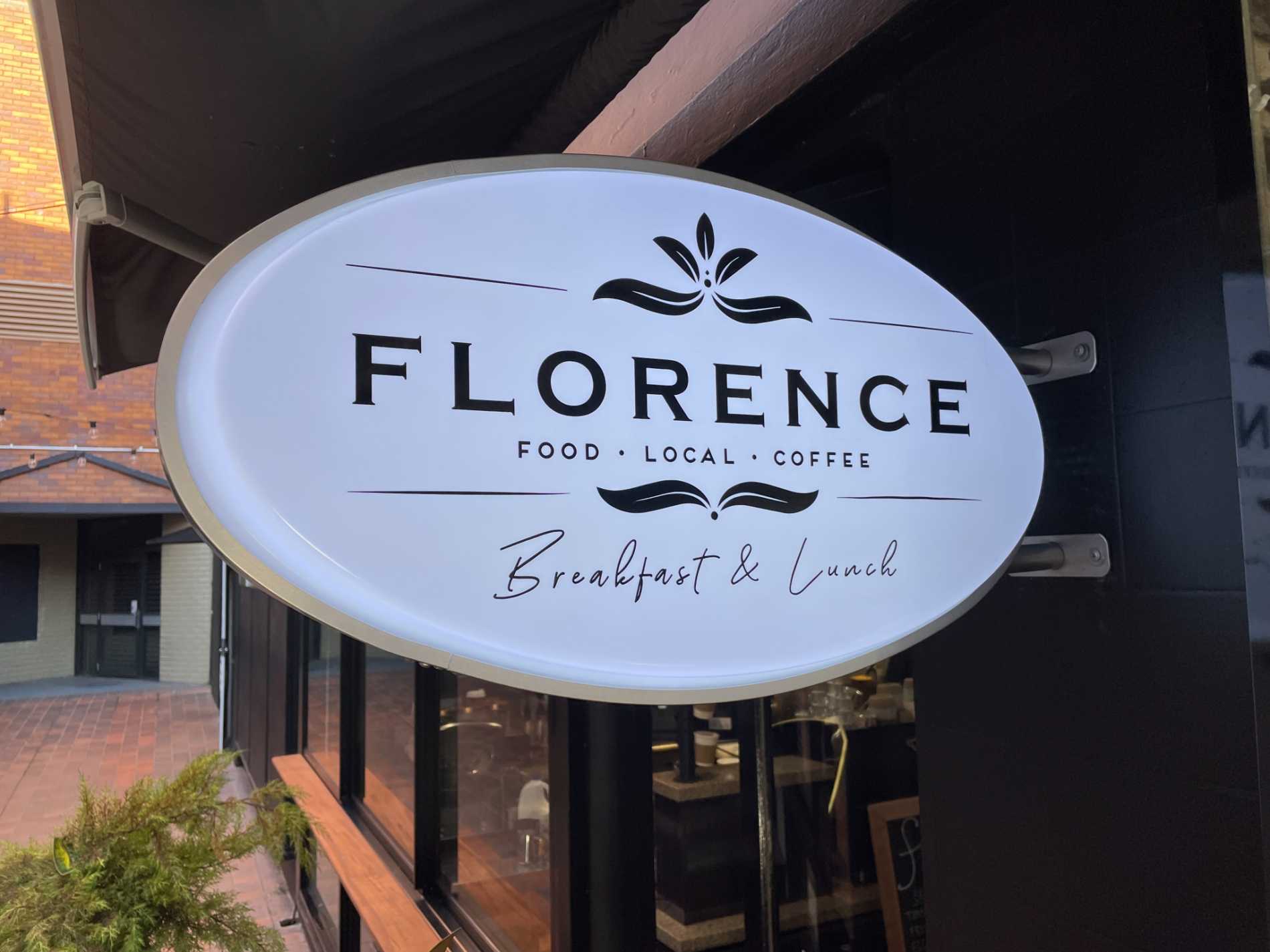
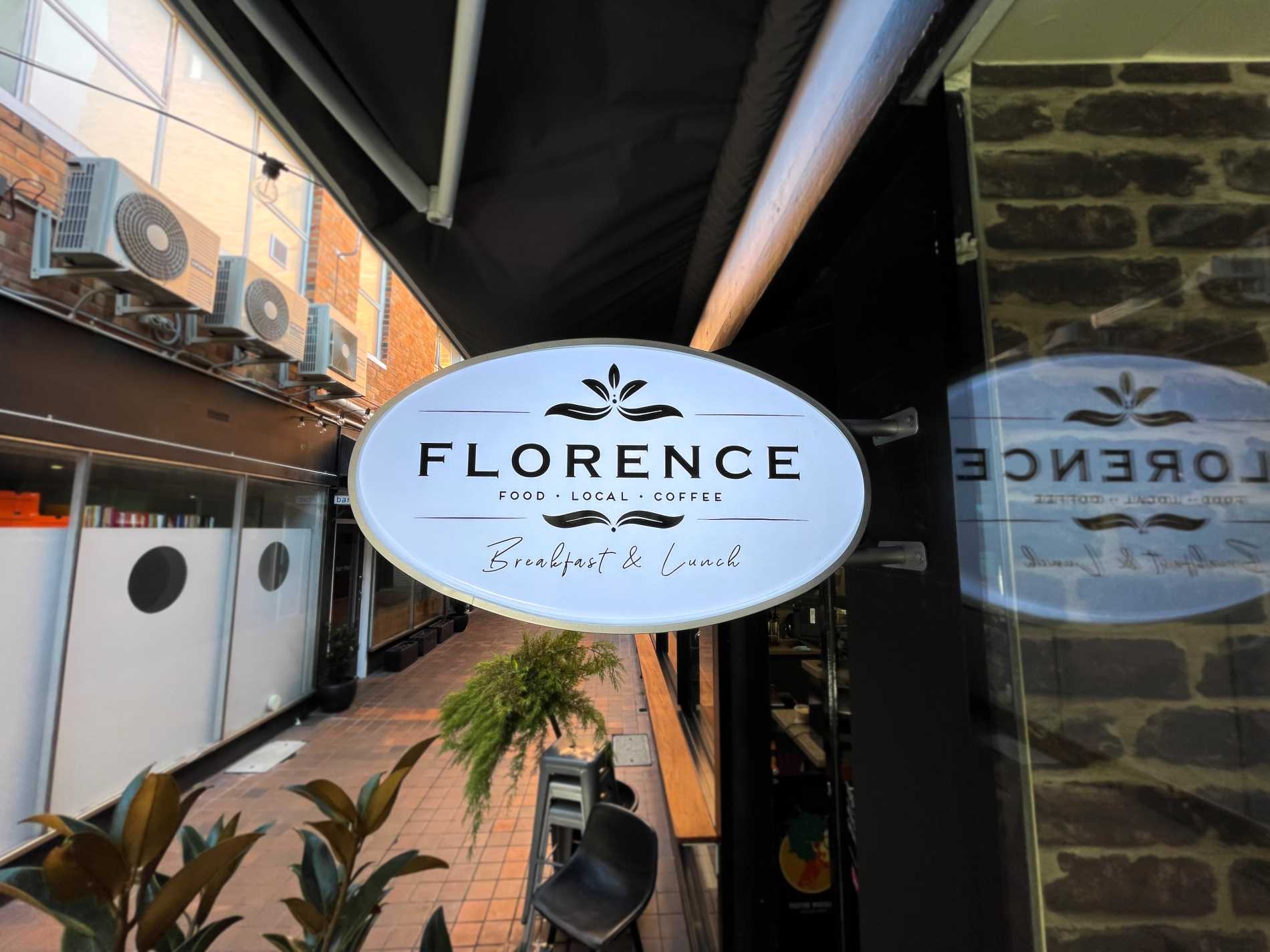
* Add a classic oval shaped exterior lightbox.
Susie our graphic designer worked closely with our client every step of the way to achieve the stunning signage and branding. We think the final result is perfect.
The storefront now features elegant front fascia and under awning signage with an additional alleyway LED illuminated sign so the store is hard to miss. Along with the building signage Florence had several window graphics installed for further visual branding. The Florence name is proudly seen from the whole street, with a welcoming appearance that compliments the employees and owners inside.